Introduction
In this article, we will learn how to create Free form exploration in Google Analytics 4 (GA4).
In Google Analytics 4, the Free Form exploration offers a more dynamic and user-friendly way to explore your data compared to previous versions.
It enables you to customize how you view and analyze your data, allowing you to organize information into rows and columns, apply filters, and create visualizations like tables, bar charts, scatter plots, and much more.
The Free form exploration is ideal for in-depth analysis, helping you detect trends, compare metrics, and fine-tune your marketing strategies based on audience behavior.
It’s a powerful replacement for the older custom reports, providing greater flexibility in presenting and understanding your data.
Let’s get started creating it.
A step-by-step guide to creating a free-form custom report in GA4
Exploration tab
Step 1) Create a Free form report
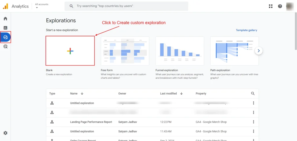
- In GA4, click Explore on the left side of the GA4 to begin.
- Simply click on the Free Form template.
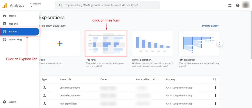
Screenshot 1: Free-form Explorations
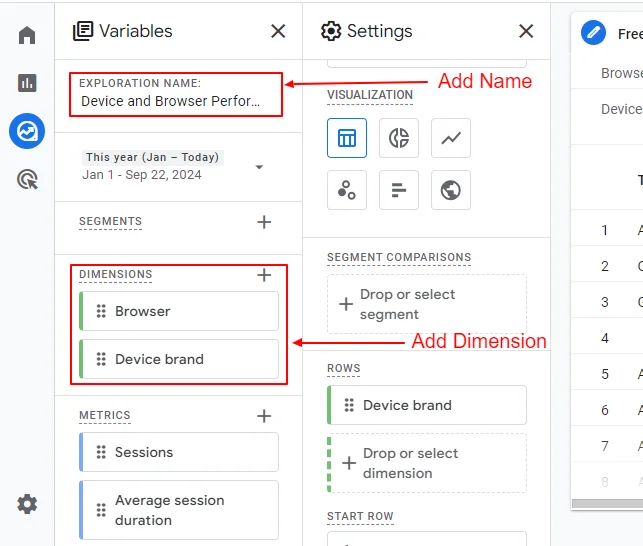
- A Free form exploration screen will open as shown in screenshot 2 below.
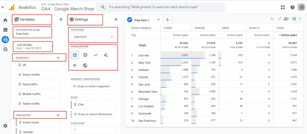
Screenshot 2: Free form exploration Variables and Settings
- There are three columns on the exploration tab, Variable & Settings panel and Free form analysis area.
Understanding Variables and Settings in Custom Exploration Reports in GA4
In Google Analytics 4 (GA4) Free Form Exploration, you can customize your analysis by choosing from different Variables and Settings to display and filter the data you need.
Setting Up the Variables Panel in GA4 Free Form Report
- Variables in (GA4) are the primary building blocks that help define the report’s structure. You’ll find these on the left-hand side of the GA4 interface.
- Under the Variables panel we can see the following sections:
- Exploration name
- Date Range
- Segments
- Dimensions
- Metrics
Step 2) Set Exploration name
- Click on the Exploration Name to give a descriptive name to the report that you want to create.
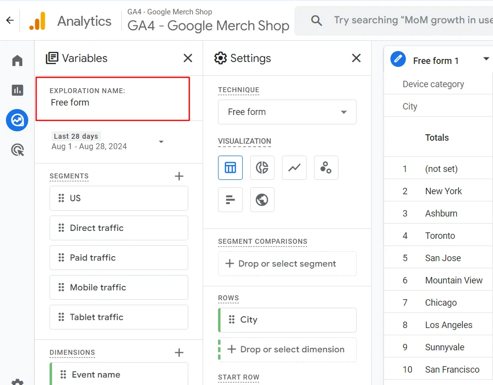
Screenshot 3: Variables > Exploration name
Step 3) Select Custom Date range
- Here you can set a Custom Date range where you can select a range (i.e. 7 days, 10 days, etc.). Enter the period for the data you want to analyze.
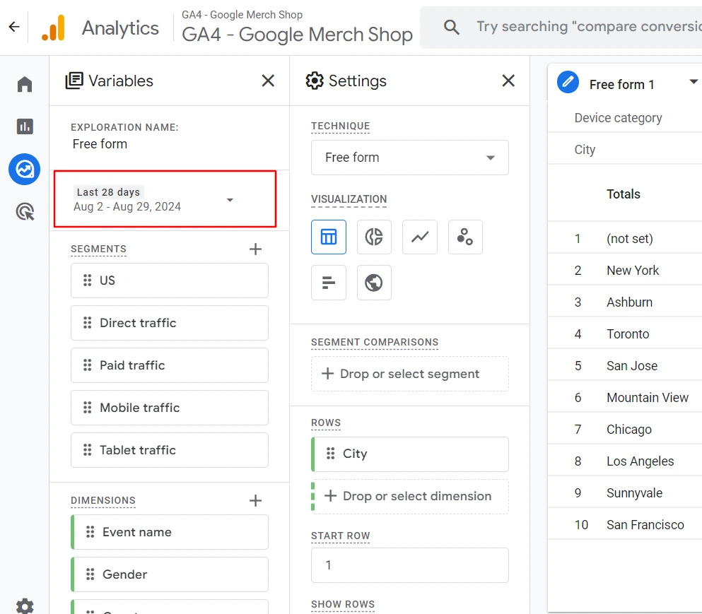
Screenshot 4: Date Range
- You get a small pop-up where you can select the date range and click on Apply.
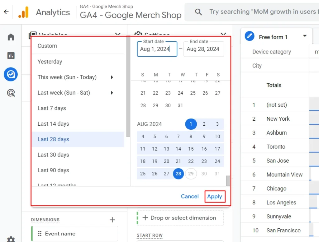
Screenshot 5: Select the Date Range
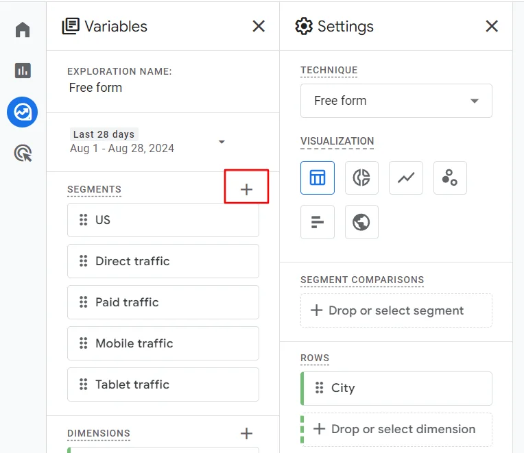
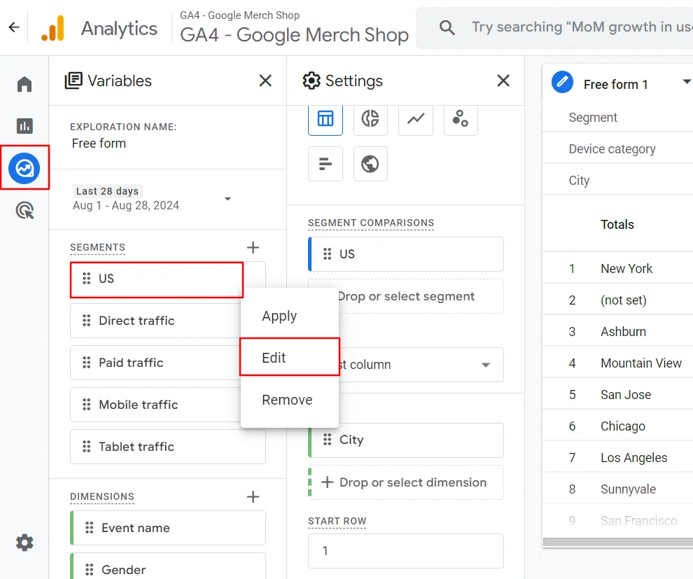
Step 4) Add Segments (optional)
- Segments are subsets of your data. They let you divide your user base into meaningful groups and compare their behavior.
- Up to four segments from the Segments section of the Variables tab can be applied to the exploration
- You can compare the behavior of different groups of users or visitors to your site by creating segments.
Using an existing segment
- GA4 by default provides five segments.
- US: Country ID exactly matches US
- Direct traffic: First user source contains direct
- Paid traffic : First user medium contains cpc
- Mobile traffic: Device category exactly matches mobile
- Tablet traffic: Device category exactly matches tablet
- From the Variables tab, you can drag the existing segments to the Segment Comparisons under the Settings panel. Additionally, you can add them by double-clicking the segment name in the Variables tab.
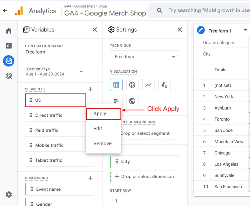
Screenshot 6: Add segments
Create a new segment
- You can also create your own custom segments based on the dimensions and metrics in your report.
- Click on “+” in the segments.
Screenshot 7: Create a new segment
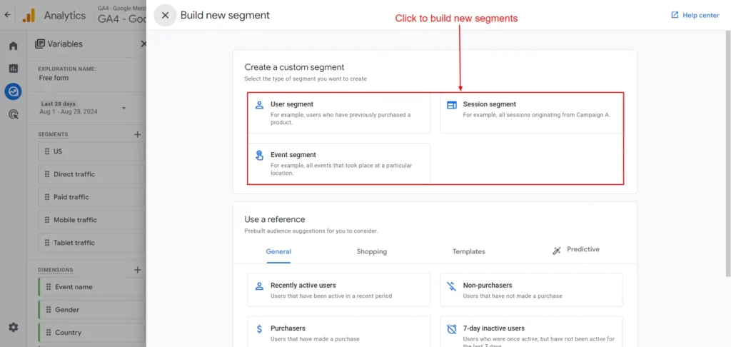
Screenshot 8: Create a custom segment
- Types of segments that can be created:
- User Segment: This segment focuses on a specific group of users based on their attributes or actions (e.g., users who completed a purchase).
- Session Segment: This segment focuses on sessions that meet specific criteria (e.g., sessions with a specific number of page views).
- Event Segment: This segment focuses on specific events (e.g., users who clicked on a specific button or watched a video).
- After choosing the segment type, give your segment a name and a short description.
- Define the conditions based on which users, sessions, or events should be included in the segment.
- Select the dimension, metric, or event that you want to use to define your segment. You can combine multiple conditions using AND/OR logic.
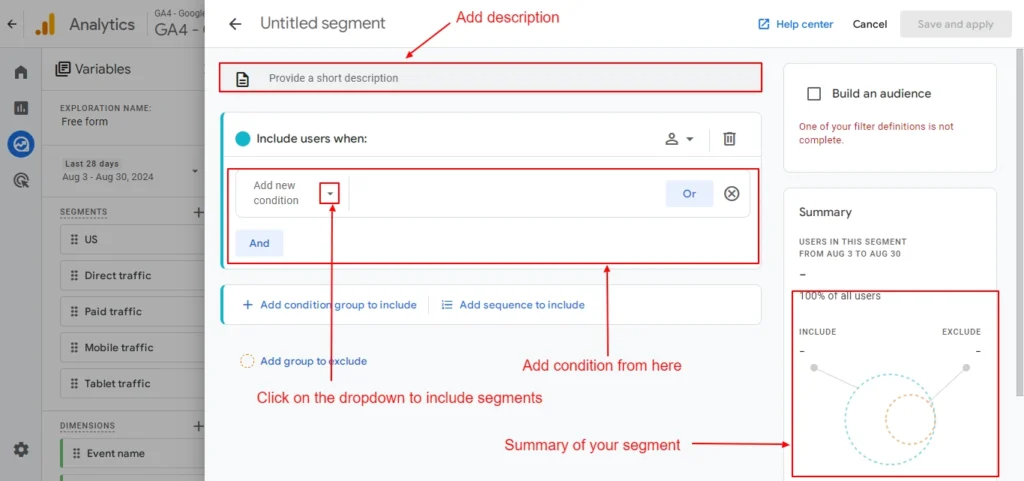
Screenshot 9: Segment description and conditions
- To do that, click on the dropdown you will get a list of Events, Dimensions, and Metrics that can be used to create segments as shown in the screenshot below.
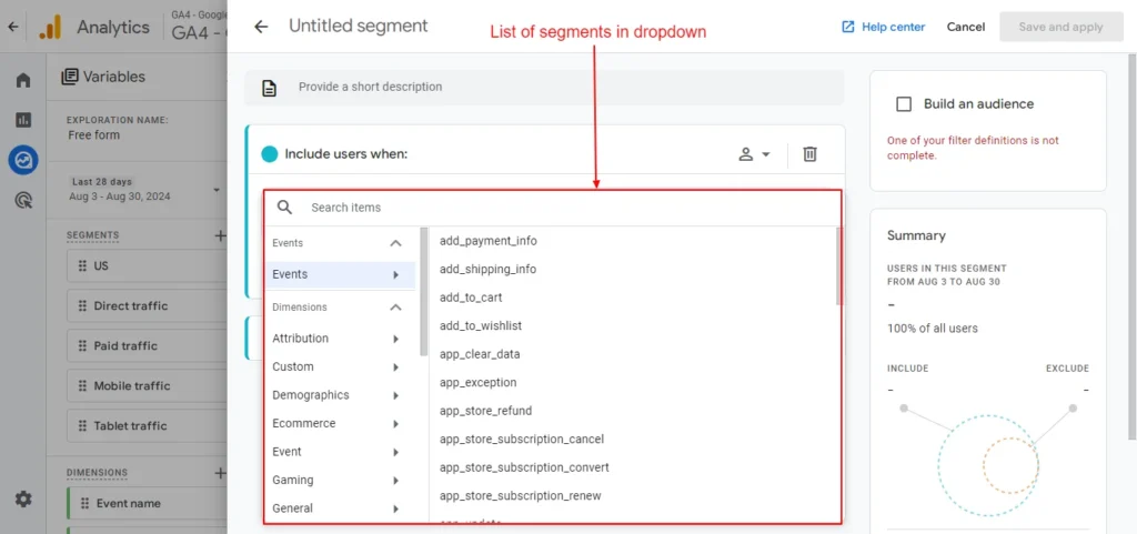
Screenshot 10: List of Events, Dimensions, and Metrics
Edit or Delete a Segment
- At times it’s required to edit or delete a segment.
- Click on Edit if you want to edit the segment as shown in screenshot 8 below.
Screenshot 11: Edit Segment
- Once you click on Edit a new overlay will appear as shown above, where you can modify the segments.
- To remove any segment, click on the Remove button.
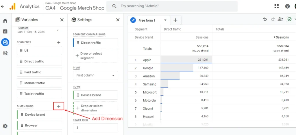
Step 5) Add Dimensions to Variables panel
- Dimensions in GA4 represent the qualitative attributes or characteristics of your data. It allows you to break down your data and analyze it from different perspectives.
- Following are the Dimension avaliable in GA4
- Attribution
- Custom
- Demographics
- Ecommerce
- Event
- Gaming
- General
- Geography
- Link
- Other
- Page / screen
- Platform / device
- Publisher
- Time
- Traffic source
- User
- User lifetime
- Video
Add new Dimensions
- Click on “+” next to Dimensions.
Screenshot 12: Click the + next to Dimensions
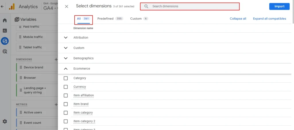
Screenshot 13: Select Dimensions (347 dimensions available)
- Double-click or Drag & drop or select the dimensions that you want.
Screenshot 14: Double-click or Drag & drop or select the dimensions
Removing the Dimensions
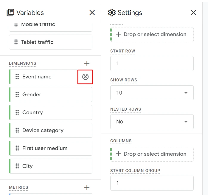
Screenshot 15: Removing the Dimensions
- Click on the close icon as seen in the above screenshot to remove a dimension from the Variables panel.
Step 6) Add Metrics to the Variables panel
- Metrics, on the other hand, are the quantitative measurements that provide insights into your website’s performance. These can include user acquisition metrics, engagement metrics, and conversion metrics.
- Following are the Metrics (metric name) available in GA4
- Advertising
- Custom
- Ecommerce
- Event
- Other
- Page / screen
- Predictive
- Publisher
- Revenue
- Session
- User
- User lifetime
Add metrics
- Click on “+” to Add metrics, as we did for dimensions.
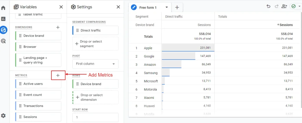
Screenshot 16: Add Metrics to the Variables panel
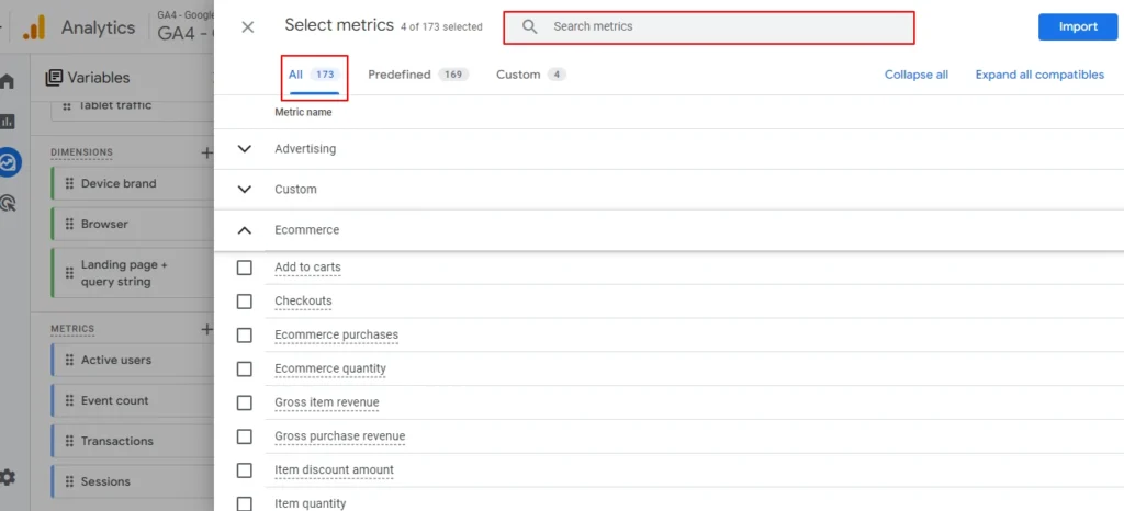
Screenshot 17: Select metrics (173 metrics available)
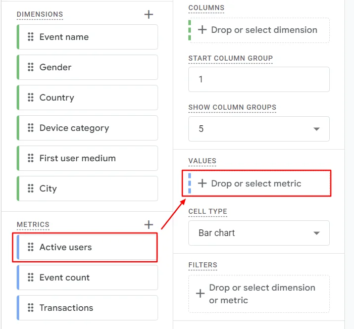
- Just drag and drop the metrics under the “Values” section under the Settings Panel, as shown in the below screenshot.
Screenshot 18: Double-click or drag and drop metrics
Remove the metrics
- Click on the close “x” icon as shown in the screenshot below to remove metrics.
- This will only be removed from the Metrics section under the Variables panel.
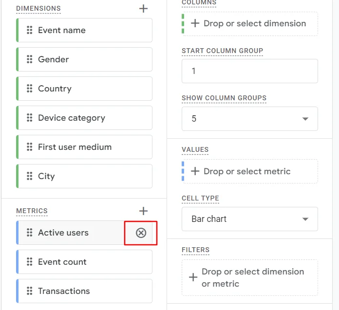
Screenshot 19: Delete metrics
It’s crucial to select the appropriate dimensions and metrics for your custom report. Having too few dimensions and metrics may not give you the insights you need, and having too many can make your report cluttered and challenging to read.
Start with a few key dimensions and metrics that are closely aligned with your business goals, and then gradually expand your report as needed.
Before creating free form reports, ask yourself the following questions:
- What are your primary business objectives and KPIs?
- What user behaviors or actions are you most interested in analyzing?
- Which dimensions and metrics should you choose that provide valuable insights add will help you in the decision-making process?
- How can you combine various dimensions and metrics to gain deeper insights about your website’s performance?
- By answering these questions and carefully selecting the right dimensions and metrics, you’ll be able to create custom Fre form reports in GA4 that deliver actionable insights and drive meaningful business outcomes.
Configuring Up the Settings Panel for GA4 Free Form Report
Step 7) Select Free form technique
- In Google Analytics 4 (GA4), a technique is the method or approach used to organize and visualize data under the Explore menu.
- Six techniques are available to choose from.
- Free form
- Cohort exploration
- Funnel exploration
- Segment overlap
- Path Exploration
- User lifetime
Step 8) Select Visualization Table (default)
- Visualization is a specific chart style applied to an exploration technique that you choose. Based on the visualization type, the data is shown in the analysis panel.
- Here’s the list of charts you get to select:
- Table (The default visualization in the analysis panel is Table)
- Donut
- Line chart
- Scatterplot
- Bar chart
- Geo Map
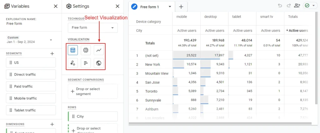
Screenshot 20: Visualization type
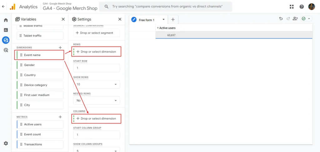
Step 9) Add Dimensions to Rows and Columns
Rows
- The Rows setting is where you add dimensions to categorize your data vertically. Each row in your report will represent a value from the dimension you select (e.g., country, device category, page title).
- Key Concepts for Rows:
- Single Dimension Rows: If you select just one dimension (e.g., “City”), each row will represent data for a different city, as shown in the below screenshot.
- Multiple Dimensions in Rows: If you use more than one dimension (e.g., “City” + “Device Category”), the rows will create a hierarchy where the first dimension (City) is the primary group, and the second dimension (Device Category) subdivides it. This allows you to drill down into the data.
- Sorting: Data in rows can be sorted by metric values (ascending/descending) for easier comparison.
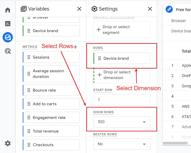
- For example, add the Device brand dimension to Rows as shown in the below screenshot.
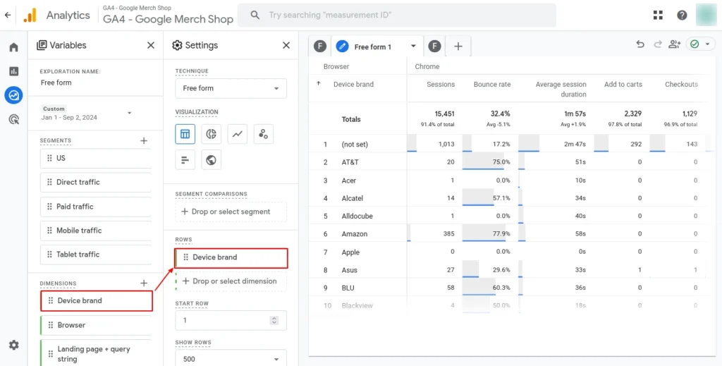
Screenshot 21: Add Dimensions to Rows
- You can also set the row start and the number of rows to display at the same time, as shown in the below screenshot.
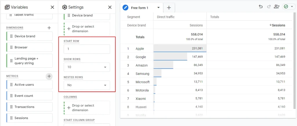
Screenshot 22: Select the start row number and number of rows to show
Nested Rows
- Nested rows in Google Analytics 4 (GA4) are a way to structure your data in reports so that it shows hierarchical relationships between dimensions.
- This feature is particularly useful when you want to break down data step-by-step for deeper insights.
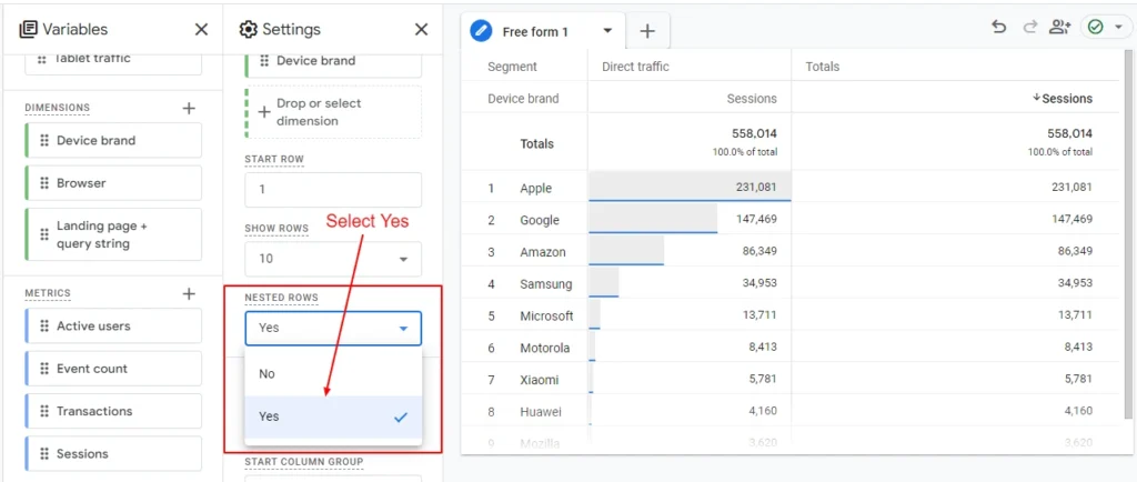
Screenshot 23: Select Yes in Nested Rows
- For example to understand how Nested Rows works
- Add Device Brand and Device Model Dimensions in Rows
- Add Browser Dimension in Columns
- Select Nested Row to yes
- Sort the data by Sessions ascending. Filter out (not set) data
- Now you will get the results as shown in the screenshot below.
Screenshot 24: Results grouped by Nested rows
- As you can see from the above screenshot
- Device model SM-S918U, SM-S918U1 are grouped under Device Brand Samsung,
- Device model Pixel 8 pro, Pixel 7 pro are grouped under Device Brand Google
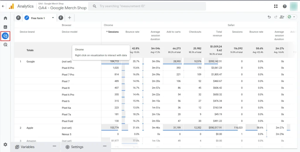
Columns
- The Columns setting allows you to add dimensions horizontally, giving you a comparative view across different categories. Columns complement rows and allow side-by-side analysis.
- Key concepts for Columns
- Single Dimension Columns: You can apply a dimension like Device Category to the columns. This will let you compare metrics for each device (e.g., mobile, desktop, tablet) side by side.
- Multiple Dimensions in Columns: If you add multiple dimensions, the columns will create a layered structure, offering deeper comparisons. However, using too many dimensions in columns can make the report visually overwhelming.
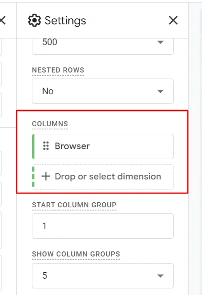
- Below is an example of Browser Dimension added in Column
Screenshot 28: Add Browser dimension in Columns
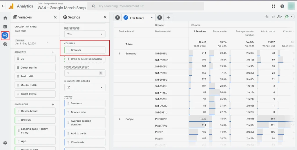
- Column Groups allow you to structure and analyze your data by breaking it down into different dimensions across multiple columns.
- Essentially, column groups let you analyze multiple dimensions of data, and they are particularly useful for comparing different segments, metrics, or dimensions in a clear, structured manner.
- In simple words, it’s the number of columns (groups) to display in the table. You can select 20 as the maximum show column group.
- For example to understand how Column group works
- Add Device Brand Dimensions in Rows
- Add Browser Dimension in Columns
- Set Start Column Group to 1 (if you set it to 3 the data will be shown from the 3rd column)
- Set the Show column Group to 10
- Sort the data by Sessions ascending. Filter out (not set) data
- You will see 10 Columns of Browser Dimension. By default its 5 which means only five columns will be shown in the table
Screenshot 29: Show column groups
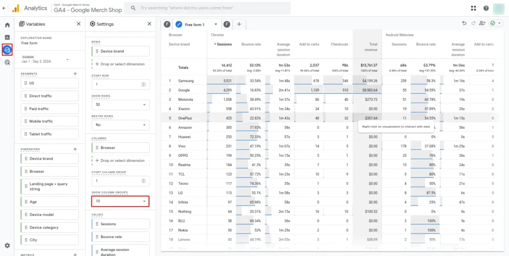
Step 10) Add Metrics to Values
- The Values section is where you add Metrics from the Variables tab. These are the quantitative elements of your report, showing the actual numbers that relate to the dimensions you’ve set in rows and columns.
- Select the metrics that you want to see in the report. A maximum of 10 metrics can be added to the Values section to be displayed in the analysis table.
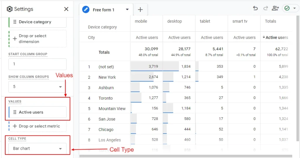
Screenshot 30: Add Metric to Values and Cell type
- By default, cell type is Bar Chart. It adds a small horizontal bar (blue border) at the bottom of each cell to represent the value in a visual way. The length of the bar corresponds to the value of the data in the cell.
- Heat Map cell type colors the cells based on the magnitude of the values. Cells with higher values are displayed in darker shades, while cells with lower values have lighter shades.
- Plain Text cell type removes any visual indicators (like bars or colors) and displays the data as simple numbers or text.
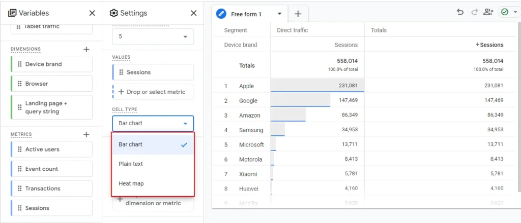
Screenshot 31: Select the Cell type
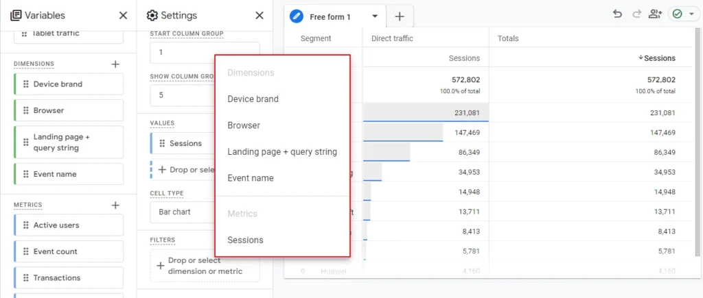
Step 11) Apply Filters
- Filters allow you to include or exclude data based on certain conditions.
- Key Concepts for Filters:
- Single Condition Filter: You can filter the report to only show data for a specific dimension value (e.g., only users from Country US).
- Multiple Conditions Filter: You can stack multiple conditions to refine your data further (e.g., users from the US who visited the website using a mobile device).
- Excluding Data: Filters also let you exclude specific values (e.g., exclude all traffic from a certain referral source).
- Dynamic Filters: These filters can dynamically adjust based on the data available, giving you flexibility in narrowing down or expanding the scope of the report.
- You can filter by Both Dimensions and Metrics
Screenshot 32: Click on Filters
- Set a condition and enter an expression that you want to filter.
- Exactly matches
- Contains
- Begins with
- End with
- Matches regex
- Does not exactly match
- Does not contain
- Does not begin with
- Does not end with
- Does not match regex
- For example, if you want to exclude page_view event.
- Then you need to select Dimension as Event Name, condition as exactly matches with expression page_view as shown in the below screenshot.
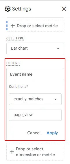
Screenshot 33: Select Event Name exactly matches
Step 12) Analysis Area
- In Google Analytics 4 (GA4), the Analysis Area (sometimes called the Canvas) is on the right side of the settings tab where your data visualization and analysis are shown.
- All the elements—such as rows, columns, dimensions, and metrics—are combined and displayed according to the chosen report type or technique.
- The selected technique is added as a tab in the analysis area.
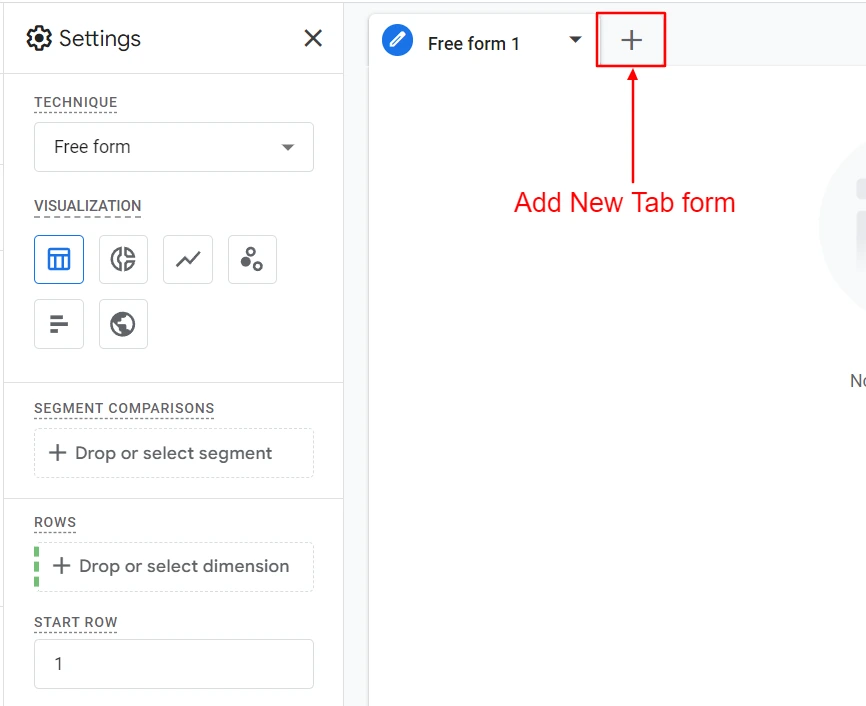
Screenshot 34: Add a new tab within the current exploration
- You can add multiple exploration techniques to the analysis area as new tabs. Select the type of exploration that you want to be shown in the New Tab. A pop-up will appear as shown below.
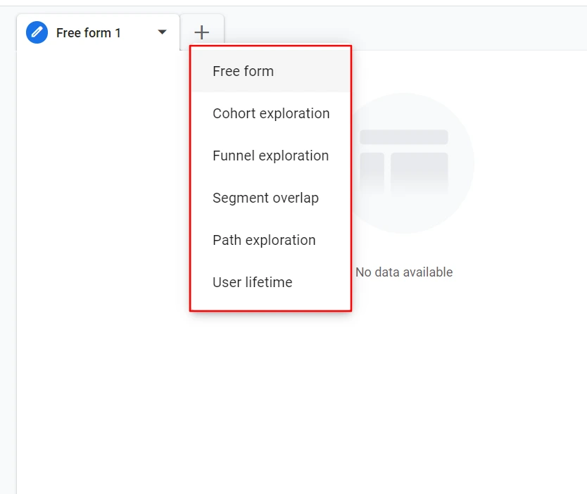
Screenshot 35: Select Free form Exploration in new tab
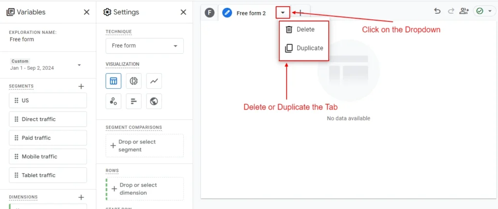
Screenshot 36: Duplicate or Delete the Tab
- You can switch between tabs easily.
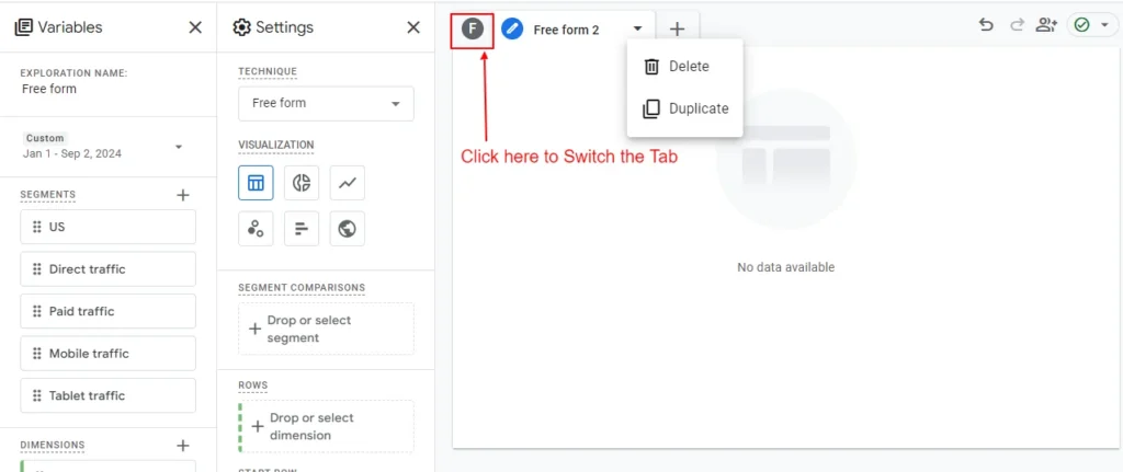
Screenshot 37: Switch between Tabs
Examples of Free-form reports in Google Analytics 4
Analyzing Device Brands and Browsers in GA4 Freeform Reports
In this sample report, let’s analyze data of different device brands (e.g., Apple, Samsung) and browsers (e.g., Chrome, Safari) in terms of sessions, average session duration, and bounce rate, along with add-to carts, checkouts, and total revenue.
Following are the steps for creating the report.
Step 13) Create a new exploration.
- Go to the Explore Tab in Google Analytics.
- Click on the Blank page.
- Create a new exploration.
Screenshot 38: Create a new exploration
- Add exploration name as Device brand and Browser analysis.
- Set the date range to This year
Step 14) Add Dimensions to Rows and Columns
- Add dimensions as mentioned in the screenshot below.
- Browser
- Device brand
Screenshot 39: Add Exploration name and dimension
- Now double-click, drag & drop, or select the Device brand dimension to add them to the Rows.
- To keep it easy, follow the color of the dimension and metrics in the Variables panel set beside every box (dotted left border), and match the color in Rows and Columns (Green) or Values (Blue) under the Settings panel.
- Select the number of rows to 500 in Show rows dropdown
Screenshot 40: Double click or drag & drop or select Dimension in rows
- Now select the Browser dimension and drop in under Columns section as shown below.
Screenshot 41: Add Browser dimension in Columns
Step 15) Add Metrics to Values
- Now add the following metrics by clicking the “+” icon.
- Sessions
- Average session duration
- Bounce Rate
- Add to carts
- Total Revenue
- Checkouts

Screenshot 42: Add metrics in the Variables Panel
- Then move those to the Values section.
- Keep the Settings > Values columns in sequence as given below
- Sessions
- Average session duration
- Bounce Rate
- Add to carts
- Checkouts
- Total Revenue
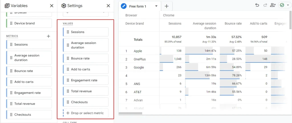
Screenshot 43: Add Metrics in Settings > Values
- After adding the values shown in the above screenshot, you will get the data shown in the screenshot below.
- Sort the data A-Z by the Device brand by clicking beside it.
- After sorting, the first 2 rows would be blank and (not set) for Device brand. This indicates that GA4 was not able to capture data of it.
- In GA4 (not set) refers to missing, undefined, or unrecognized data for a specific dimension or metric.
- Blank data in Google Analytics 4 (GA4) can occur when certain data points are missing, improperly configured, or not tracked. Blank cells in reports indicate that GA4 couldn’t collect the relevant information for a given dimension or metric.
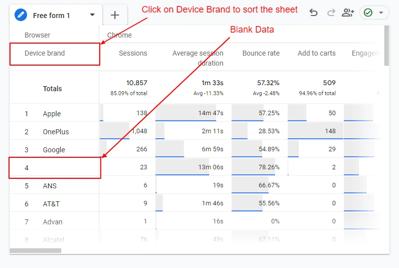
Screenshot 44: Sort the data by Device brand
- To skip the blank and (not set) data of Device brand, scroll down to filters under the Settings Tab.
- Select dimenion Device Brand.
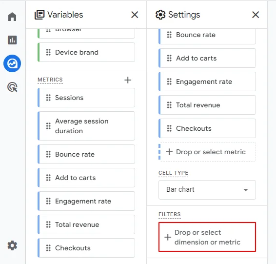
Screenshot 45: Filters
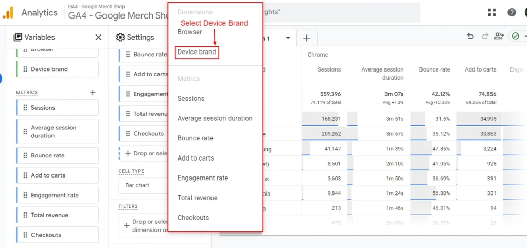
Screenshot 46: Select Device Brand dimension
- Select match type does not contain.
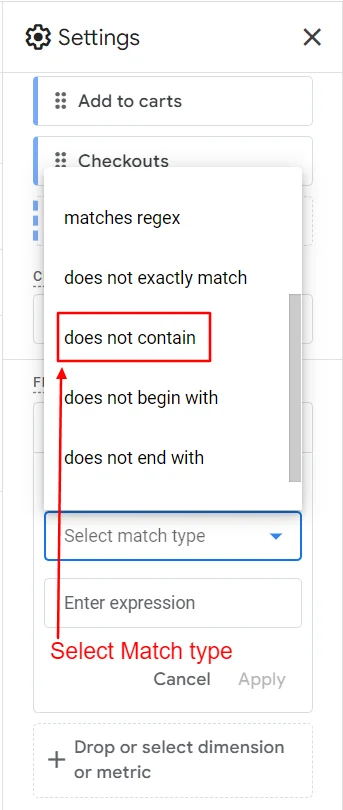
Screenshot 47: Select match type does not contain
- Enter the expression (not set) and click on Apply.
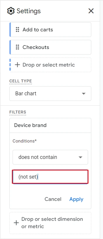
Screenshot 48: Set Filter Expression to (not set)
- After clicking Apply you can see that the (not set) is filtered.
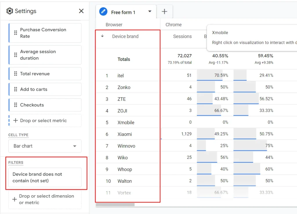
Screenshot 49: (not set) data is filtered
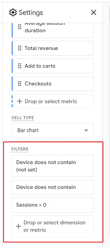
- Same as you did for (not set) perform the same steps to filter empty data.
- Set the Dimension as Device brand, match type as contains, in expression, add blank space, and hit Apply.
- Another filter that can be applied is to show sessions greater than zero. For that, select match type as Sessions and select condition “>” and expression “0.”
- You will see the filters applied in the screenshot below.
Screenshot 50: Add Filters
- After applying all filters, you will get the data as shown below.
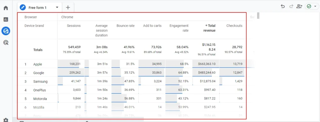
Screenshot 51: Data after Applying Filters
Step 16) Analysis of Device and Browser Performance Report
- The above free-form report shows different browsers and device brands sessions and buying journeys.
- Below are the insights of it.
Sessions
- As we can see from the data, Google and Apple devices have the highest number of sessions, with an average session duration of 3 minutes 57 seconds and 3 minutes 51 seconds.
- Also, the bounce rate is 35.12% of Google and 31.5% of Apple respectively.
Total Revenue
- As we can see again, Apple (33,995) and Google (32,863) device brands have the highest numbers of add-to-carts and checkouts, hence the total revenue.
- Revenue generated from Apple devices is $633,363 and that from Google devices is $483,244.
Conclusion
In this blog, we learned about creating a Free form report from scratch. We also understood the concept of dimension and metrics, which are basic building blocks for creating free form reports.
The ability to create Free form custom reports in GA4 is a game-changing feature that empowers you to unlock the true potential of your website data.
As you continue your journey with GA4, here are some key next steps to consider:
- Regularly review and update your custom reports to ensure they continue to align with your evolving business goals and priorities.
- Experiment with different combinations of dimensions, metrics, filters, and segments to uncover new insights and opportunities for optimization.
- Collaborate with cross-functional teams to align your custom reporting efforts with broader organizational objectives.
- Stay up-to-date with the latest GA4 features and updates, as the platform continues to evolve and enhance its reporting capabilities.
- Continuously evaluate the effectiveness of your custom reports and make adjustments to improve their impact and usefulness.
By embracing the power of custom reports in GA4, you’ll be on your way to unlocking a new level of data-driven decision-making for your business.
Build
Website
Themes